The dashboard is the first thing you see — a calm, at-a-glance read on every account’s health. Here’s what each part tells you.
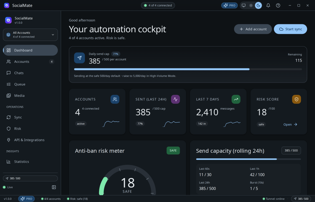
The KPI tiles
- Accounts & connected — how many numbers are linked and online right now.
- Messages today / last 7 days — your sending volume at a glance.
- Risk — the highest current risk score across your accounts, colour-coded safe → critical.
The status bar
Along the bottom you’ll see live sync status and tunnel status (with the public URL when a tunnel is up), so you always know whether your archive is current and whether the outside world can reach your API.
The activity feed
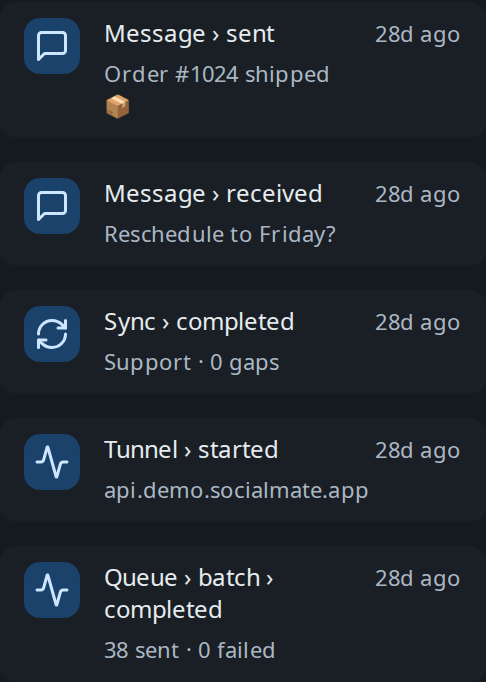
A running log of what’s happening — connections, sends, sync jobs, anti-ban actions — so nothing is a black box.
Tip. The same vitals are mirrored in your system tray, including a Pause-All panic button — handy when you’re not looking at the main window.
Go deeper with Statistics
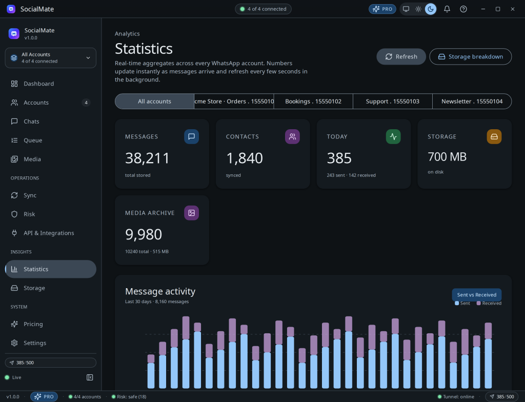
When you want more than a glance, the Statistics page is a full cockpit: global and per-account stats, a 30-day activity trend, your top contacts, a message-type breakdown, and an activity heatmap.

Getting around
The left sidebar takes you to Accounts, Chats, Queue, Media, Sync, Risk, Statistics, Storage, API, and Settings. Each has its own KB section — start with Reading the risk cockpit to understand the safety story.